How Data Visualization is Key to Business Success
In today’s data-driven world, it’s not enough to merely collect data; you have to understand it. You could be sitting on a goldmine of insights, but without the right tools to unearth them, they remain buried.
That’s where data visualization comes in. It turns endless rows and columns into actionable insights.
If you’re looking to elevate your decision-making, unearth hidden patterns, and drive your business forward, this comprehensive guide to data visualization is your roadmap. From defining what data visualization really is to debunking common myths, and from practical tips to expert-level strategies, you’ll be armed with everything you need to navigate this game-changing field.
What is Data Visualization?
At its simplest, data visualization means representing data graphically, like through charts or graphs, to make information easy to understand and actionable.
To take it a bit further (since nothing is every as easy as it first seems), it’s an interdisciplinary approach that blends design with algorithms, and statistics. For the experts in the room, think of it as a synergistic translation of complex data structures into visual models for analytical insight.
No matter where you fall on the spectrum of data visualization expertise, you’ll master the subject in no time!
Click here if you’re wondering how easy it is to learn data visualization
Why Data Visualization is Important
Data visualization may feel like an optional skill to layer in to your team or organization because the people you’re sharing results with are fine with consuming the data tables you share. They like the details, after all!
I hear that more than you know, but let me give you some compelling reasons to make make using data visualization a focus & part of your overall strategy.
Data visualization is important because:
Reason #1: Enhances Decision-Making
I am on board to have gut feelings initiative a data analytics request, but data trumps gut every time (if it’s accurate with solid underlying data). Throw in a visual & you can see the results & patterns that make data-driven decision making possible. Seeing trends will also reduce some risk from the decisions you’re making.
You’ve got the underlying data to support you which lends to better outcomes with more confidence.
Reason #2: Unveils Hidden Patterns
I’m going to be cliche, but a picture is worth a thousand words. It’s true because a grid of numbers simply is tough to parse out any patterns on seasonality or trends unless it’s just glaringly obvious like going from 1 to 1,000,000.
Recently, I was reviewing some dashboards for a call center. I was new working with this client, so I was just exploring their existing reporting. I started adding in some visuals to help me explore, and I found what was essentially a line that was getting disconnected.
No calls were coming in for a specific customer type (calls are routed by customer type to get to the right people trained to help them). Yet no one had noticed because the calls are sent to a group that was overall getting calls.
An entire subset of customers were not getting served. Data visualization to the rescue.
Reason #3: Boosts Business Efficiency
The brain simply processes pictures faster than a table of data. If you’re looking to put actionable insights in someone’s hands and let them do their business, visuals are going to do that faster & with more impact.
Reason #4: Reduces Complexity
Sometimes data analytics gets complex & sometimes just the industry jargon necessary makes a topic complex. Pictures strip some of that complexity away, so data visualization is a no-brainer way to incorporate pictures to share information.
The valuable insights will come from simplification of any data visualization. Highlight the problems. Highlight the outliers.
Reason #5: Improves Impact
A lot of sharing results includes recommendations and decisions. Visuals help drive that message home & naturally lends to storytelling, as well. The combination of a good presentation in a story-like format and a good set of supporting visuals to bring the audience along in the journey increases the impact of what you’re sharing.
Important: You might think that data visualization is just for data scientists. The truth is, it’s crucial for everyone from marketing to C-suite.
To understand the key principles that make data visualization effective, check out this article on Key Principles of Good Data Visualization.
Explore the 20 Benefits of Data Visualization if you’re not quite convinced.
Real-World Applications of Data Visualization
Understanding a topic is one thing; applying it is what counts & where the magic truly happens.
Scenario: You work in a call center operation where the calls that come in are the focus. However, you’re managing a team that supports a more back-office research function that requires more depth than a traditional call center representative is able to tackle. You know how many cases are managed, the backlog is managed, but your spreadsheets aren’t telling you much else.
Getting that information connected to Tableau (my personal favorite data visualization tool), and start measuring how many days these cases take to complete. Trend that with a line chart over time.
Then notice how many are completed over a timeline that would feel like a negative experience to that customer. With some simple graphs, this call center back office function developed a service level expectation & improved it by 20% in 2 weeks.
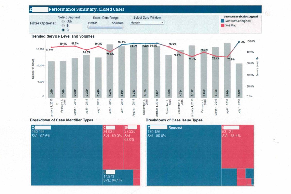
With some simple visuals.
🔗 Spotlight: For inspiration, check out Google Trends to see how they employ data visualization to uncover trends from a unimaginably large amount of data.
Not sure when the effort of data visualization is worth it? Read this article on when to use data visualization to optimize your resources – whether it’s time or money.
3 Best Practices to Start Using Data Visualization Today 🚀
If you want to jump in now, there are some easy ways to do that
- Start Simple: Less is often more. Take one data table & turn it into a column or line chart.
- Story Matters: What story does your data tell? What is the summarized viewpoint (aka tldr)
- Think About the Audience: What do they need? Data people tend to think in the weeds, but think through the images you need to support what your audience needs. Not you. Check out this list of 35 data visualization types for some inspiration.
If this sounds like too much, I challenge you to replacing once data table with 1 chart this week. That’s all it takes to level-up!
For more strategies, read the Best Practices in Data Visualization article.
‘What is Data Visualization?’ Key Takeaways
Data visualization is not merely an optional skill; it’s an essential tool for business success.
- Understanding Data: Collecting data isn’t enough; understanding it is crucial.
- What Is It: Data visualization graphically represents data, blending design, algorithms, and statistics.
- Importance: Enhances decision-making, reveals patterns, boosts efficiency, simplifies complex data, and improves impact.
- Best Practices: Start simple, focus on the story, consider the audience.
At Coffee Break Data, my mission is to make data actionable and understandable for anyone that wants it!

