Data Visualization Principles: Your Blue Print for Success 🔑
In today’s data-centric landscape, mastering data visualization principles is not just about making information look good on a chart; it’s about crafting a narrative that resonates. The challenge isn’t just gathering information but making sense of it. And let’s be honest, a spreadsheet full of numbers can be a sleep-inducing sight for even the most enthusiastic data nerds among us.
This guide is tailored to teach you how to share complex data in a way that is both visually appealing and deeply insightful. From foundational guidelines to advanced techniques, you’ll find actionable insights that are both effective and ethical. No matter your role—be it in marketing, analytics, or leadership—this guide is designed to equip you with the tools you need for success in data visualization.
Why Data Visualization Principles Matter
First, data visualization is simply a graphic representation of data. Think charts, trends, patterns, outliers all usually in the form of a picture. The aim is to communicate information clearly & efficiently, and that happens best using pictures.
I could go find some research, but honestly the saying, “A picture is worth a 1,000 words,” captures it perfectly. It’s not even a true picture, but you get a graphical image in your head by comparing a photo and 1,000 written words.
Data visualization is essential—but why adhere to specific principles? Think of these visualization principles as your building blocks, the non-negotiables that elevate your visuals from merely presentable to transparent, accurate, and actionable.
Enhanced Decision-Making
Baking in visualization principles optimize the decision-making process. It’s not about replacing gut instincts but rather refining them through the use of data. When you can visualize data effectively, you’re not just looking at numbers or bars; you’re viewing trends, outliers, and patterns that can be turned into actionable insights.
Imagine analyzing sales data over several years; a line graph can instantly show you seasonal spikes & outliers, enabling faster, more accurate decisions versus a cross tab of rows and columns that requires slower mental processing.
Storytelling and Impact
Stories are not just what you’re saying. A compelling visual is a storytelling medium in its own right. Data visualization principles help you uncover a story & craft a message visually to engage your audience emotionally — even in a business setting. Data is a left brained conversation. Good visualization principles engage some left & right brain, but stories bring in the right brain. Impact exponentially increases when what you’re sharing engages both.
Pie charts might get a bad rap, but that’s a story for another day. A pie chart segmented by demographics can reveal the untold story of a product’s diverse customer base or lack there of since your pie chart should NOT have too many slices.
Principles like proportion and color contrast come into play to turn data into a story. To make the story obvious use colors to highlight the point you’d like someone to see. You’ll naturally draw their eye to that area. Group categories by color to illustrate trends, highlight with sharp contrasts or a specific data value to start sharing a message before you’ve even added any text.
In general, we read from left to right, top to bottom. That means important elements need to be at the top, & the most important on the left side of the top. That doesn’t mean load it up, though. A single page (whether a dashboard, Excel spreadsheet or presentation) for 1-2 points is the max. That forces you to get rid of clutter whether that be from cramming 5 charts, unhelpful axis lines or using action or story-enhanced headlines. White space is your friend.
Accessibility and Universal Understanding
Data visualization principles make your visuals accessible to a broader audience. Scale, labels, alt text, and color choices all add to a design that can be easily interpreted, regardless of your audience’s background in data analysis. This allows your creations to have a wider impact and allows for more inclusive decision-making.
While certainly not the only visual constraint, the most common is color-blindness. Men are statistically more likely to have this limitation, and something like 1 in 10 have a version of color blind perceptions. So by not considering solid principles of good data visualization, it’s possible you’re ignoring 10% of whoever looks at your work.
And don’t get me started on, “But we don’t have any color blind people in our room.” You shouldn’t make them announce it. Just make your visuals inclusive & carry on with the best reach & impact possible.
And thinning your visuals to 1-2 points per page, slide, sheet, whatever is a key data visualization principle for a clear message. Clearing the clutter to the point will help get your point across for universal understanding.
Ethical Representation
Data visualization is powerful but can be manipulative if executed irresponsibly—even if on accident. Following accepted principles helps ensure the ethical representation of data. This is not just about avoiding misleading charts but also about considering the implications of data categorizations or the omission of certain data points. When you respect principles like integrity and fairness in visualization, you contribute to a culture of ethical data usage.
Data visualization principles are not just an academic exercise; they are the bedrock of effective, impactful, and ethical data communication. Adhering to a set of rules or principles is a way to be sure the intended message is shared with the right supporting information. For a deeper dive into why visualization is so critical, check out this article on the importance of data visualization.
Key Data Visualization Principles
The whole purpose of taking raw data & spending the time to a thoughtful output is simply to efficiently share a message or story to an intended audience. It’s simply, but if you were in the weeds putting something together, it can be tough to pull yourself back out to have a macro view. That’s what is required to have real impact.
And that’s where a set of principles can help. Having a set of guidelines you think through makes sure that’s what’s happening when you spend the time to make it useful through visualization.
1. Know Your Target Audience
Before you even consider visualization principles, you have to know who you’re going to share the information with. More importantly – what do they want? Why do they care? OR.. Why do you want them to care?
I have a set of questions I try to ask when I approach any new project. Read those here.
Key information on your audience helps you create visualizations tailored to who needs to see them. A CEO wants different information than an operations manager is looking for. Knowing who you are talking to helps create visualizations that meet their expectations & align with the impact you’re aiming for. Plus different people are at different places in their data literacy journey. For example, a waterfall chart to someone with an accounting or finance background lands differently than someone with out it. If you have to explain the graph, you’ve likely chosen the wrong view. Which leads me to…
2. Pick the Right Visual for the Data
This is where the true visualization starts. You have data. You know who needs it & why. Now what do you do with it? When I was a newer analyst, I’d put together whatever chart that felt right. Maybe I hit the mark, maybe I didn’t. There were a lot of pie charts back then. Probably even 3D.
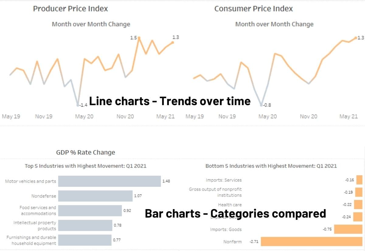
To level up and ensure you’re following sound visualization principles, you must know that different chart types are built to display certain types of data. For example, trending lends itself to a line chart with the time along the x-axis.
Here are some rules of thumb to keep in your back pocket:
- Categorical (text categories like names, teams, or products): bar charts, pie charts
- Quantitative (numbers): histograms, line graphs
- Geospatial (location based): maps <– I’ve never found a business audience that doesn’t loves a map.
I won’t cover all of the chart types here to keep focus on principles. If you find yourself hunting for the right chart, I’ve got a resource with 35 chart types & when to use them for data visualization to explore here.
The key takeaway here is that the chart you choose should match the data and message you want to show. Sometimes it’s a large, single number. Sometimes that’s a line chart.
Before we move to the next visualization principles, here are some common mistakes I see to avoid:
- Don’t use variety for the sake of variety. If you need 2 bar charts, use 2 bar charts.
- Don’t clutter a view. I aim to have 1-2 points per slide, dashboard, page, whatever.
- Skip the fancy new chart you found a way to create. I know how fun it is, but that often takes away from the data. If you NEED to explain how to read a chart, you’ve lost impact points.
- It’s ok to use what your audience is used to. Whether it is branding or a certain type of chart a certain way, you can add some level of familiarity. There is no need to recreate the wheel, but more importantly, it leaves mental energy to showcase the impact I want to highlight if I can anyhow.
3. Grab Your Audience’s Attention
If you’ve spent any time on TikTok, you’ll know that attention is king. A snappy intro will keep you on that video longer. A good creator will keep you watching until the end. The same can be said when visualization is in play, too.
This circles back to – Why does your audience care? If they don’t know, then it’s up to you to answer = Why should they care?
Titles Matter
Headlines and titles are one of the first thing someone sees. Even if I’m creating a single chart, that title is key. I’m a big fan of using an active headline to grab attention and get to the point. This elevates the message by telling your audience what matters whether they’re looking at the true visualization yet or not. Of course, you craft the headline FROM your data, so in essence it becomes a text-based part of your overarching data visualization.
Then you dive into your visualized data, but I don’t think of them as separate entities. This is the window to attention. Here are some key headline takeaways & options to incorporate today:
- Be specific
- Be brief
- Use a question. I find this very useful when titling a chart as it helps you answer the ‘So what’ for your audience.
- I prefer to use a casual, conversational title as if I were literally reading it to them.
Lastly, if you’re creating a multi-slide presentation, use your titles as a sort of a road map to where you are leading the audience.
Design Matters
I am a huge fan of not spending hours tweaking a presentation to death, but there is no denying it. Polish matters when you want someone to hear your message & take you seriously.
White space is your friend. Cluttered charts or decks are tough to understand without explanation. Reduce what you’re sharing to the true minimum to get your point across.
Tweak your layout. Center your charts in a way that makes sense. Order the elements in a way that makes sense. And keep in mind that the top left is your most valuable real estate for impact & attention.
Use color wisely. Red, amber, and green reports are seriously a pet peeve. Accessibility is big, but reports with a stoplight hue assault your eyes & are amateur looking anyhow. Plus, it’s not even helpful. Let’s walk through this. Aren’t you really targeting the red anyhow? Once the red is handled, you’re going to what… tackle the yellow? That’s not likely the case. Color can be used to highlight something noteworthy with a sharp contrast or even a grouping of data points to indicate patterns. The takeaway – use color to be a part of the message.
A key visualization principle I adhere to is a type of branding. Whether this is your brand, your team’s brand or some other consistent formatting, what you create looks much more polished if you’re consistent. Using 12 point Segoe UI. Use it in all places that way. Colors, axis lines, titles, legends… There are a lot of pieces that you might touch, but if you touch one element in what you’re sharing, touch them all throughout. Bonus points if you use a similar theme for anything you create. I have had some interesting situations where a pieces of a presentation was taken out of context, and someone reached out knowing I created it by looks alone. THAT was satisfying.
Plus, when thinking about dashboards, if you use consistent filters in a consistent way between different ones, you’re reducing the learning curve & adoption with your users. Win!
At the end of the day, when it comes to design, simplicity is the ultimate data visualization design principle. Clear, concise & actionable is what all visualizations should aim to achieve.
Visualization Principles Key Takeaways
When it comes to data visualization, the principles you adopt make or break the effectiveness of what you create. It’s not just about displaying numbers and charts; it’s about communicating a narrative that resonates with your audience. If you walk away with nothing else, here are five key visualization principles to guide you:
- Know Your Audience: Understand the background and needs of your audience or you’re wasting everyone’s time.
- Visual Storytelling: Make complex information more relatable and engaging by using charts to craft a story.
- Choose Appropriate Charts: Select chart types that best represent your data, ensuring clarity and relevance
- Embrace Simplicity: Avoid clutter and focus on simplicity to enhance the impact and understanding.
- Don’t Overuse Color: Highlight key data points but your data visualization is not usually the right time or place for a full-on rainbow of distraction.