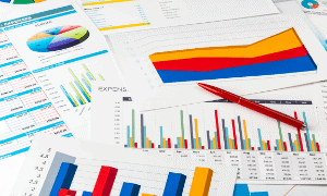
Uncover Insights Faster: Mastering Data Visualization Basics
Data visualization is fascinating because it makes complex information a visual and understandable form. By taking the time to dive into data visualization basics, you’ll gain insights that can transform how you interpret and present data.
Data visualization is the process of turning raw information into a visual that conveys a message – whether a status, critical message or decision-making information.
Think about bar graphs, pie charts, and other common ways data is presented. These are just a few examples of how we can present data visually. But there are many other ways to do this. Each has its own use depending on the data we’re working with.
Knowing the principles behind data visualization is key, though. These rules guide us to present our information clearly. And when done right, our data not only makes sense but tells a compelling story.
In my journey exploring data visualization, I’ve learned so much. Every day brings a new technique or a new way to make my presentations even better. I hope to share these valuable insights with you so you can benefit from the potential of data visualization.
Your data holds untold stories, and data visualization is key to discover & share them.
- Why Data Visualization is Important
- Key Skills for Effective Data Visualization
- Types of Charts and Visualizations
- Data Visualization Tools: A to Z
- Data Organization for Visualizing
- Data Visualization Challenges and Pitfalls
- Real-World Applications of Data Visualization
- Strategies for Enhancing Your Data Visualization
Why Data Visualization is Important
Data visualization, in its simplest form, turns complex information into visual stories. When you see data as a graph instead of raw numbers, it becomes easier to spot trends, patterns, and outliers.
It’s a skill I use daily to make numbers and patterns more comprehensible for my audience. I can change that data story based on that audience, too.
For instance, imagine trying to analyze the sales data of a company over the past decade. With data visualization, you can use a line graph to plot sales over time, immediately revealing upward or downward trends. Without such visuals, finding these trends in a spreadsheet of raw numbers would be much more challenging and time-consuming.
Data visualization also provides essential context. When you can see the relationships between data points, the bigger picture starts to emerge. For example, a heat map of a website can show where users spend the most time, which can help improve site layout and user experience.
Another reason why I find data visualization indispensable is its ability to speed up data analytics. Visuals allow us to identify trends and patterns in data swiftly, leading to quicker, more informed decisions.
“Data visualizations, frequently referred to as information graphics, are a powerful tool that will inform and educate your readers.”
Berkeley Advanced Media Institute
A well-crafted dashboard, for example, can provide real-time updates about a business’s key performance indicators (KPIs), allowing decision-makers to react promptly to any changes.
Data visualization is more than just making pretty pictures. It’s a tool that helps interpret and communicate data effectively, providing context for analysis and helping in fast decision-making. If you’re someone who deals with data, learning the basics of data visualization can truly be a game-changer.
Now that you’ve gotten a taste of what data visualization can do, you’ll want to check out this guide on the importance of data visualization to dive into how this can revolutionize your decision-making process.
Key Skills for Effective Data Visualization
Diving into the world of data visualization, I quickly learned that it’s not just about pretty charts. It’s about mastering the basics, developing a set of skills that would enable me to turn complex information into easily digestible visuals.
At the top of the skill list is understanding data types. There are two main kinds: categorical and numeric. Categorical data, which consists of names or labels, whereas numeric data, which, as you may guess, are numbers. Learning the nuances between these types is important because it helps determine the best visualization method to use – the foundation of visualizing data

Understanding a bit of design will help make impactful visualizations. Colors, scale, legends, knowing when a graph has too much in it… Picking just the right color to highlight crucial data points will help tell the story & make the visuals more intuitive.
Creating effective infographics became an indispensable skill in my toolkit, as well. Infographics are a blend of different visualization methods – think charts, graphs, etc. They serve to present information in a visually engaging way. They’re especially handy when you’re dealing with a complex idea or when your audience might not be well-versed in data science but need a run-down of results.
Proper data management practices, though often overlooked, are a key component in the process. Put simply, if the data is wrong, your visualization will be no good. This includes collecting, cleaning, and organizing data prior to the visualization process.
In my experience, developing these basic data visualization skills have been a great key to success. I’m also aware that there’s always room for growth, so I find that having a strong foundation in these areas is key to success. That said, you can certainly focus on one element at a time to work on improving.
Types of Charts and Visualizations
There are many types of charts and visualizations available to represent data even if we’re talking just data visualization basics at this point. The variety can be overwhelming, but I’ll do my best to briefly describe some of the more commonly used ones to help you get started.
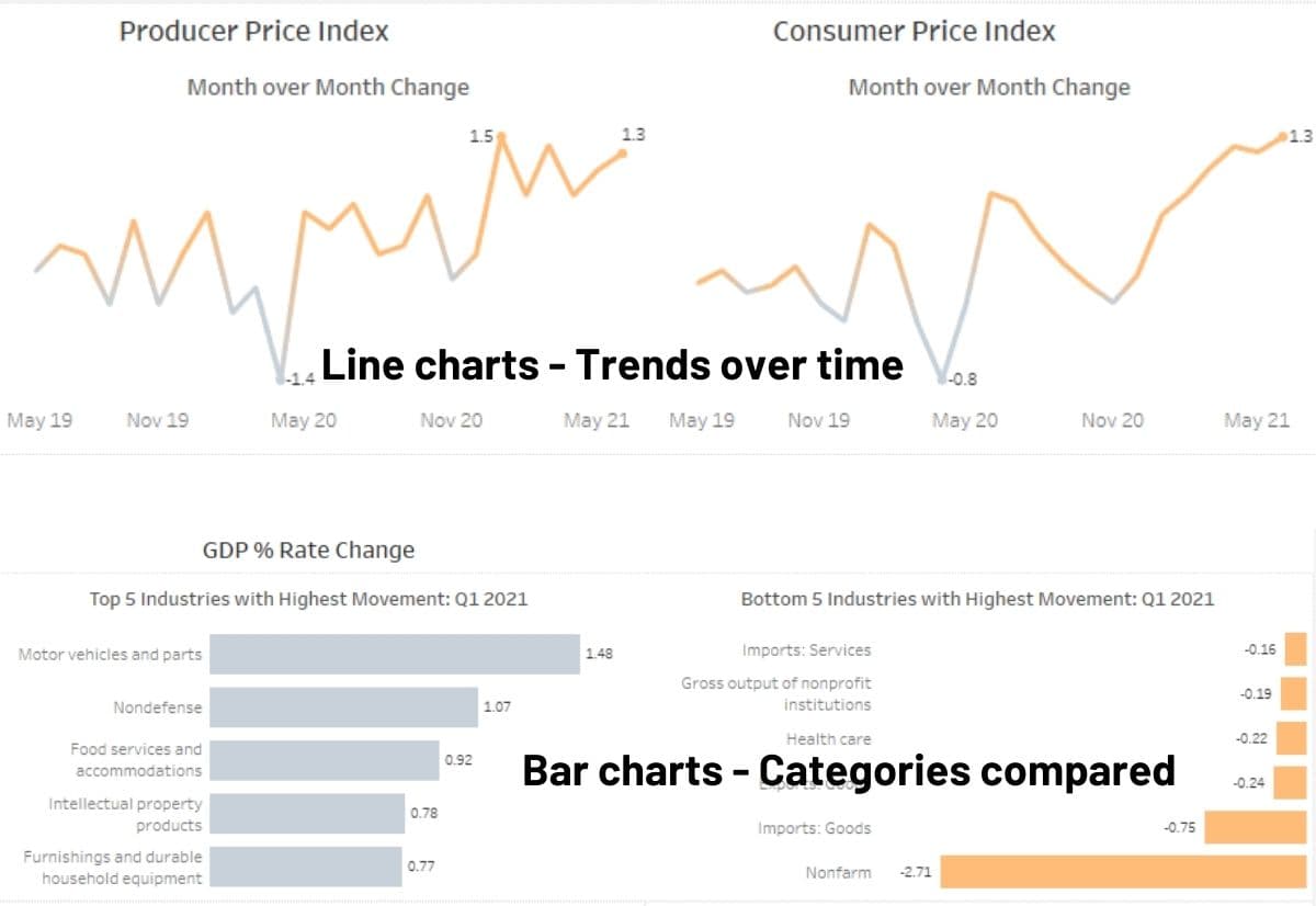
One of the most basic and widely used chart types is the bar chart. It’s great for comparing data across categories, and can be displayed either vertically or horizontally. Imagine you’re evaluating the sales performance of different products; a bar chart would be ideal for such a comparison.
Line charts excel in showing trends over time. For instance, they can depict a company’s growth in revenue over several years. Area charts are similar, with added emphasis on the magnitude of changes, useful in showing web traffic increase after a marketing campaign.
Pie charts are useful for showing proportions or percentages. A pie chart could visualize the demographic breakdown of your website visitors as an example. BUT, too many slices of the pie make them hard to read.
Maps are excellent for displaying geographical data. Heat maps, for example, are great for showing density or intensity in a specific area, like visualizing crime rates across different areas in a city where colors are darker/less dark depending on the rate. Dot distribution maps are other ways to visualize spatial data, like that same crime map with dots for each instance to see how many times an event or item occurs.
Scatter plots display relationships between two variables, like comparing advertising spend and sales results. For hierarchical data, radial trees are useful, and matrix charts visualize relationships between multiple data sets.
To show the distribution of data, consider using a histogram. They can show, for example, the distribution of customer ages.
If you want to compare data with multiple variables, a bullet graph or box and whisker plot might be useful. For tracking projects or tasks, you can use Gantt charts or timelines.
Sometimes, you’ll want to focus on specific data points. In these cases, highlight tables or bubble clouds can be useful visualizations such as highlighting top performers in a sales team. For representing word frequency, you might want to consider a word cloud which can be helpful in looking at text responses like in customer experience surveys.
Unique chart types such as streamgraphs and waterfall charts, which can be used to represent data in a visually appealing way such, but these are not options to pull out of your back pocket unless the audience knows how to read them.
These are just a few examples of the many charts and visualizations, and each visualization type offers unique strengths. As you become more familiar with data visualization, you’ll find that the possibilities are nearly endless. Remember, the key is to choose the right chart for your data and make it easy for your audience to comprehend the information you’re presenting.
Data Visualization Tools: A to Z
It is important to have the right tools at your disposal. Generally, what you have available to you is a great place to start, but here is an overview of additional tools to help you transform raw, complex data into something accessible and engaging.
You’ll find most organizations have Excel, so it makes a good go-to. It’s mostly simple courtesy of having existed on most corporate computers for decades. It is excellent for creating basic charts and graphs. Excel is ideal for handling small to medium-sized datasets.
Tableau was my first introduction to seeing real impact through data visualization. It was a game-changer for creating dynamic, shareable dashboards. Its intuitive drag-and-drop interface made it easy to create visually impressive and interactive visualizations with relative ease.
For those not afraid to delve into something more like programming, R and Python can produce data visualizations tied with advanced statistical analysis & better equipped to handle large datasets. Both are key languages in data analysis. Pairing R with the ggplot2 package, or Python with libraries like Matplotlib, Seaborn, and Plotly, opens up a world of customization, allowing control over every single detail of the visualization.
If you have Microsoft products at work, I see Power BI as the obvious choice for exploring data visually. Developed by Microsoft, this tool offers interactive visualizations coupled with business intelligence capabilities, and it is a key competitor to Tableau. Creating reports and dashboards is a breeze with its user-friendly interface.
Then we have QlikView, which is all about converting raw data into valuable insights. Its ability to associate and traverse data over time helps uncover hidden trends and connections.
For the tech-savvy folks comfortable with web technologies, D3.js is an attractive choice. This JavaScript library lets you create captivating, interactive data visuals. However, be prepared to get hands-on with HTML, CSS, and SVG.
For a comprehensive analytics visualization platform, look no further than SAS Visual Analytics. It provides a platform that reveals otherwise hidden patterns and relationships in data.
Google Charts, a free and easily integratable tool, offers static and interactive charts that can be seamlessly embedded into websites.
Lastly, Looker stands as a robust platform for data exploration and discovery. With a variety of visualization options and excellent collaboration features, it’s a reliable choice for complex tasks.
Each of these tools comes with its own set of strengths and suitable scenarios. I select the tool based on the intricacies and demands of my projects. So, why wait? Pick up your tool of choice and start crafting your data story!
Data Organization for Visualizing
When I start working with data visualization, the first thing I focus on is understanding the data to make sure it is organized in a way that will support working with it effectively. It’s the foundation for creating effective and informative visual presentations.
If you’re working with data in Excel, you’ll need to be sure that you’re organizing data into rows and columns for the basic building blocks of tables. Rows usually represent individual data points, while columns indicate different attributes or characteristics of those data points.
A well-organized table starts with clear headers for each column if you’re working with data that isn’t in a data warehouse ready to work with.
If you’re able to work directly with data compiled for you through a data warehouse, then you’re really starting through understanding the data. Exploratory Data Analysis (EDA) is how I do this.
Data Visualization Challenges and Pitfalls
As someone passionate about data visualization, I’ve encountered numerous challenges and pitfalls along the way.
One common pitfall is the tendency to create visualizations that may unintentionally mislead the audience. For example, when comparing data with a horizontal bar chart, it’s essential to start the bars at zero. It’s what is expected, so it can be misleading to those viewing the data & make minor adjustments appear more volatile.
Another challenge in data visualization is distinguishing between correlation and causation. A strong correlation between two variables does not automatically mean one causes the outcome of the other. You may have heard this before – Correlation does not imply causation.
It’s also essential to choose the right type of visualization for your data. Different visualizations highlight different aspects of the data, so selecting the most appropriate one for your goals is crucial. For example, if you want to display change over time, consider using line charts or area charts. If you’re going to show the distribution of values, then a histogram or box plot might be more suitable.
Lastly, be cautious when displaying multiple data sets in a single visualization. Visual clutter can make it difficult for your audience to interpret the information effectively. Try using color, shapes, or size to differentiate, but don’t go overboard. Keep the visualization clean and simple.
By being mindful of these challenges and pitfalls, you can create effective and accurate data visualizations.

Real-World Applications of Data Visualization
Remember when I said that data visualization helps us tell a story? Let’s look at a few real-life examples to drive that point home.
- Sales Performance Tracking: Organizations use line graphs or bar charts to visualize their sales data. This enables them to understand their sales performance over different periods and identify any trends or patterns. For example, a line graph can show how sales have increased or decreased over the past few years, helping businesses make informed decisions about future strategies.
- Website Traffic Analysis: Companies use heat maps to understand how users interact with their websites. For instance, a heat map can show which parts of a webpage are most frequently clicked or hovered over. This data can help website designers and UX professionals improve the site’s layout and overall user experience.
- Employee Productivity Tracking: Businesses can use Gantt charts or timelines to manage and track the productivity of their employees or the progress of specific projects. This visualization can show what tasks are pending, in progress, or completed, which helps in effective project management.
- Marketing Campaign Evaluation: Scatter plots can be used to visualize the effectiveness of advertising campaigns by plotting advertising spend against sales results. This can reveal any correlation between the two variables and help marketers assess the success of their campaigns.
- Public Health Tracking: Government agencies use data visualization to track and communicate public health issues. For instance, during the COVID-19 pandemic, governments and health agencies worldwide used various visualizations to track the spread of the virus, hospitalization rates, and vaccination progress.
- Budgeting and Financial Analysis: Government and corporate entities often use data visualizations like bar graphs, pie charts, or waterfall charts to present budgetary information. For example, a pie chart could be used to show how a government’s annual budget is distributed across different departments or sectors.
- Human Resources Management: HR departments can use visualizations to analyze employee data. For instance, a bubble chart could be used to represent employees’ performance scores against their engagement levels. This can help HR identify any trends or patterns and develop effective strategies for talent management.
Remember, the goal of data visualization is not just to present data, but to present it in a way that is easy to understand and tells a story. Whether you’re managing a business, leading a team, or making policy decisions, effective data visualization can help you make better, data-driven decisions.
Strategies for Enhancing Your Data Visualization
When it comes to data visualization, think of it as storytelling with numbers. To tell a great story, you need to refine your skills. Here’s how you can level up:
First, cut the clutter. In your visuals, remove anything that isn’t necessary. Just like in a clear, direct email, you want to ensure the main points are easy to understand.
Next, consider how it looks – the aesthetics. Everything from the colors, fonts, and sizes you choose should make your visualization clear and engaging. Think of it as dressing up your data in its best outfit for a presentation.
Balance is key when deciding how much data to show. Too much information can be overwhelming, like an overcrowded inbox. Keep it to the essentials, so the audience can grasp your main points without getting lost in the details.
Always double-check your data!!! It’s crucial to ensure your information is correct and up-to-date. Think of it like fact-checking an important report or email before sending it.
Lastly, consider adding interactive features to your visualization. Features like zoom, filter options, and tooltips give users the freedom to explore the data at their pace depending on the software you’re using. It’s like providing a useful tool or resource for your team to better understand a project.
In short, enhancing your data visualization is a mix of design, accuracy, and understanding your audience’s needs. By consistently refining your visuals, you’ll create clear and compelling data stories that aid decision-making.
What are the essential steps in creating visualizations?
Which tools are popular for data visualization?
For instance, Tableau, Power BI, and Google Data Studio are great for creating dashboards and interactive reports without needing to write much code, whereas Python libraries such as Matplotlib, Seaborn, and Plotly provide more flexibility and are often used for data analysis and exploration.