This is When You Should Use Data Visualization
Whether a business or individual, data is collected all the time from different sources. But what is the use of all of this? Data adds no value in itself. It must first be converted into information and that information must become knowledge. Data visualization is the tool with which to do just this.
Data visualization is used to convert data into easily discernible and digestible information upon which thought and insight can be derived and data-driven action can be taken.
Need to turn tell a story from data? That’s where data visualization comes in. It’s a visual format of rows and columns of a large amount of information.
Why is Visualizing Data So Important?
It bears repetition that the value of data is in what you do with it, not just in the fact that it exists.
You need a method through which large and small data sets can be presented in such a way that the audience would be able to clearly tell what the Data is pointing them to and why.
Data has been likened to the new oil. I think this metaphor is apt. The large amounts of data being mined on a daily basis can be likened to the oil mining boom from decades ago.
Imagine that after drilling, refining and processing the raw material, the oil is just left in large containers and not in, for example, fuel pumps. Most consumers would not have the tools, means or patience to make it useable. That is the same thing with data.
When you gather all this data, analyze, and refine it. Now imagine that it is kept in thousands of pages of text and rows and rows of a spreadsheet. The people who can benefit from it are limited. On the other hand, the people that do benefit from it have to do more to make sense of it and much of that sense may be lost.
Visualizing data has changed, for the better, the way we make sense of the information at our fingertips. Now more easily, patterns, trends, and outliers that may otherwise be missed in the presentation of information, especially from large swaths of complex data, can be better understood.
The importance of data visualization can’t be overlooked when you think of it in the context of how much data we find ourselves swimming in!
Who Uses Data Visualization?
Short answer; everybody.
Data visualization is a skill needed increasingly in every career by everyone. Data is collected in and for marketing, travel, education, science, politics, business, financial data, search engines, personal matters, societal matters, social media, social debate…. the list is endless.
The world has since the middle of the last century entered into and is now fully in the fourth industrial revolution, which you may have heard coined as the digital age.
We live in a data driven world. We have advanced systems, for gathering, measuring, storing and processing data. We collect and analyse this data in order to gain information on trends, changes over times, academic, social and scientific issues that affect different aspects of our lives and careers.
As a person, citizen, consumer, student, educator, business person, career person, or leader, in order to stay on top of things, you cannot avoid working with data.
You would either be the researcher and presenter or the audience and stakeholder that must make decisions, or form opinions and insight on the basis of data at one point or the other.
Scorecards, operational reporting, those lengthy PowerPoint decks displaying charts are examples of data you may encounter at work.
When Do You Use Data Visualization?
In general, data visualization is used when data needs to be presented and needs to be instructional, inspiration, informative, and involving.
Known as the four I’s of digital storytelling, if information needs to be one of the I’s, then a visualizing data will be more effective than a quick chart & moving on.
Different people have different levels of Data visualization literacy, in the same way that people have different levels of textual and numerical literacy. Thus, Data visualization speaks to different needs.
After you have collected and analyzed data, you use data visualization to present it in a form that is easily understood. This helps to remove the noise from data and bring to light useful information and insight. The following is a list of examples when data visualization will aid in conveying a message:
- When you need to highlight important information at a glance
- When you want to ensure that important details are not missed
- When you want to confirm the information is retained by the audience
- When you want to ensure a specific message is conveyed
- When you want the audience to remember the storyline with greater accuracy (The human brain remembers visual information longer!)
- When you need to present multidimensional patterns at a glance. The more complex a story, the more it will benefit from visual help.
- When you need to show trends, patterns, and associated changes over time
Complex data such as people demographics, events and trends in different countries, or analysis of data regarding long periods of time involve layers of information that can visualized.
The human factor of how helpful data visualization can be cannot be over-emphasized. It creates a stronger human connection between technology and information that can be incredibly powerful.
When using visual storytelling, you are more focused on your audience and how they perceive and actually receive the information. It also bridges the gap between analysts and operations.
A scenario that could easily play out where information from data is not presented in the way that the intended audience can make sense of it; the audience may feel like researchers or analysts are not addressing their questions, whereas the researchers may think that all their work in gathering the data and presenting the information is not being put to good use. It thereby making it seem like wasted effort. Data visualization helps to bring these groups together.
When an abstract concept is presented in form of relatable images, it is better received. It’s that simple. The audience understands it as actual knowledge and not abstract concepts that may otherwise have go over their heads or failed at capturing and retaining their interest.
The summary of it all is that when you need to help your audience or yourself to more easily glean insight, highlight problems, patterns and outliers or effortlessly update changes in order to make data-driven decisions, you use data visualization. And let’s be honest, it more fun.

How Do You Do Data Visualization?
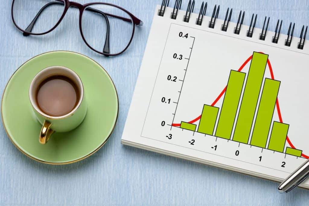
I think it is important that we touch on this a little. Charts & graphs are the bread and butter to visualization.
Data visualization is done by present data in charts and graphs that allow data insights to occur.
There are different presentations of visualization techniques. From simple to complex and the basic to the very creative techniques.
The most common types you will see is a bar chart and line graph. However, there are plenty of options including the charts below:
| Area Charts | Pie Charts |
| Box-and-Whisker Plots | Bubble Cloud |
| Bullet Graph | Cartogram |
| Circle View | Scatter Plots |
| Dot Distribution Map | Heat Map |
| Highlight Table | Histogram |
| Matrix | Network |
| Network | Radial Tree |
| Streamgraph | Text Tables |
| Timeline | Treemap |
| Wedge Stack | Word Cloud |
A collection of graphs you may see called a dashboard. Infographics are also a collection of information intended to be a type of data visualization.
Visual representations of data is a complete specialization on its own in the data analysis career choice. How you decide to display information from the chart types to the colors used, titling, fonts, and so much more goes into effectively showing data.
One of my favorite best practices is to avoid using red and green when colors to distinguish one pattern from another. Operations folks tend to request this pallet, but did you know that people that are color blind struggle to see a variation in color between red & green?
Approximately 1 in 12 men and 1 in 200 women in the world are color blind (ColourBlindAwareness.org). So chances are, in a team of people, at least 1 are going to see your graphs differently. Why make it harder than it has to be? This is just one example of the importance of visualizing data well.
Data Visualization Software Options
These days, you don’t need a PhD in data science to create great data visualizations. The tools available today are made in such a way that a larger group of people who want to either, work on their skills, make a career out of it or simply provide a good presentation, proposal or business plan can find options available to them.
We have Microsoft Excel, Google Charts, Tableau, and Power BI are fairly mainstream and available on many computers fairly easily. These tools are equipped to handle decently large data sets, are user friendly and offer different options from simple to complex templates depending on your competency.
You can find data visualization tools that offer free services with plenty of options. Tableau Public and Power BI are examples of software to check out. There are also paid services which, as would be expected, have expanded options.
The internet is saturated with information on how to gain a working knowledge or expertise on data visualization. Whether free or paid training fits your budget, the tools are so well-known and accomplish so much that you have plenty of options. Webinars, YouTube videos, blogs, books, trainings on Udemy and more will help you get a better handle on how to use your tool of choice.
Check out the article I put together to help you approach learning more about data visualization here.
If you search for it, there are available examples online where you can find how different data sets are presented with the best suited data visualization techniques.
Social media is also a good place to look. An example is the Tableau community (a personal favorite of mine) where you have opportunity to practice with data sets, see what others are doing, get feedback on your work, comment on other people’s work, get a sense of belonging to a community and learn new tips and skills.
Twitter is also a popular place to connect and see what other analysts are creating.