22 FREE Visualization Tools to Try Today
Software can be expensive, and data visualization software is no exception. Microsoft’s Power BI appears free until you realize the levels of their structure, and let’s not even talk about SAS. That said, there are more than a few free visualization tools that will get the job done.
There are many reasons why a free resource would be a great option for you. You could be a new user who wants to get in practice hours for your data visualization journey, a small business not ready to invest in a larger footprint, or a charity organization seeking to share insights from data publicly.
Regardless, data visualization is needed to tell stories with data and create interactive, easily accessible, and understandable insights from data and free visualization tools are very useful and a great resource.
Dashboarding
Google Data Studio
Google Data Studio is a part of Google’s free cloud services. It’s truly free. You just need a Google account in order to connect to a variety of data sources, and it provides simple and basic chart templates, creative, interactive, and automated graphs and dashboards for small businesses, teams and individual users.
Google Data Studio is a full featured free visualization tool that offers the ability to create simple reports or dashboards that bring in a variety of data sources.
Google Data Studio is not quite as intuitive as other tools, and the charts can feel more basic, but there are a host of templates put together by users and Google itself to help with the building process.
Google developers have created a new feature that allows for additional options, functionalities, and templates from reviewed and approved partner visualizations along with options for customization. This has opened new possibilities. Now users can create custom charts or specialized components in visualization or branding options for their client or business.
Google Data Studio also integrates with seamlessly with Google products such as Google Analytics and Google sheets. Google Data Studio makes an excellent, free data visualization tool to start with if you’re currently looking to consume native Google data sources.
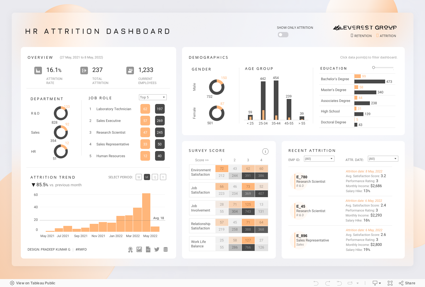
Tableau Public
Tableau is a big player in offering data visualization solutions for business intelligence and data insights.
Highly interactive data visualizations with an intuitive designer interface is a specialty of Tableau server.
They have an ever-expanding footprint that starts with Tableau Desktop and Tableau Online creations that can be shared via Tableau Server. Then, let’s layer in the data prep solutions.
It can be expensive to deploy, but that’s the end of this story.
Tableau Public is completely free and is an online data visualization tool ready for sharing insights.
It offers a wide array of options for producing great visuals for exploring, reporting, and telling stories with data. You can connect any data format and web API. You can share and benefit from publicly shared visualization. It is an easy-to-use tool for users with different competencies. Tableau Public integrates well with data sources such as Google sheets, Microsoft Excel, SAS datasets, and even SPSS.
The catch here is that your data is also saved publicly – both the dashboards and your underlying data.
The underlying data is stored with the dashboard versus connected to secure, private locations on your computer or a server with authentication requirements.
Concealing your data would require an upgrade, so I recommend you use publicly available data. Another option would be to aggregate information to minimize publicly available underlying detail that can be downloaded by anyone with Tableau Public.
I’m a huge fan of the wide variety of visualization capabilities of Tableau, but it is important to be aware of the free limitations.
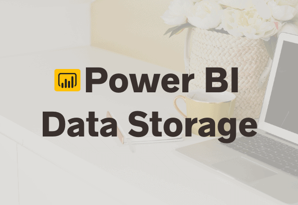
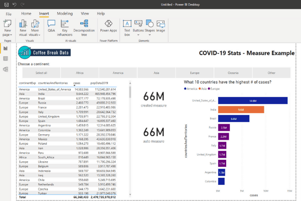
Microsoft Power BI
Power BI is a reporting tool created by Microsoft. It is a data visualization platform that serves up reports and dashboards with a high degree of interactivity.
There is a free version along with a Pro & per user Premium options that do have associated costs.
That said, the free version of Power BI is full-featured. The elements left out are things like Advanced AI, embedding APIs and the like.
Getting your data ready for dashboard is called a data model within Power BI, and this is done with the Power Query interface. This means that Excel power users will find interacting with Power BI easier than some of the other options.
However, data models within a file can only be up to 1 GB of data. If large, multi-source data sets are your norm, you might be impacted by this.
Microsoft Power Bi is however one of the richest and most important data visualization tools available. It offers an abundance of graphs and real-time dashboard options. It displays ranges of data, charts, and tables on a Power BI dashboard and combines data from multiple sources.
Sharing is problematic as your only option is to share the file like you would any other desktop file. Another Power BI user can open the reports, change them just like an Excel file – but without the ability to lock cells and sheets.
Weave
Weave is an acronym for Web-based Analysis and Visualization Environment. It is an open-source visualization tool that is web-based and in beta stage with constant updates.
It has gained traction because it is easy to use once you get it set up, and it is very flexible. It integrates with various data sources, is interactive, has an array of charts along with customizable, high-performing maps, and tables.
Even in beta it has some rich visualizations to explore – all for FREE!
Databox
Databox is a cloud-based tool that connects with over seventy integrations. Data can be entered manually or through Google sheets or connecting to one of those integrations, to build graphs, tables, and dashboards. It works with information such as the Google suite of data products, Facebook Ads, Adobe Analytics, Zapier, Shopify, Snowflake and so many more.
The premade graphs, templates, and design dashboards allow unskilled users to use the tool without help.
The free version allows more than a dozen standard, but key features, over sixty databox integrations, more than three thousand pre-built metrics, and over two thousand third-party integrations Push Custom Data to API, three data source connections, three custom dashboards, and five users. It keeps months of historical and is mobile friendly.
Oh and I have to mention that ‘s fairly user friendly, as well, with good support so far in my experimenting with it.
There are also free trials if you are interested in more than the 3 connections allowed with the free plan.
GoodData
GoodData is a visualization tool with a solid data modeling component. It also has the drag and drop functionality that makes it good for beginners to try with limited training yet has robust ability to customize elements for insightful reports.
The free version is limited to 5 workspaces at 100 MB per workspace for those interactive reports. There is also an enhanced encryption that is left out for standard users.
Infogram
Infogram boasts that it’s an, “…intuitive visualization tool that empowers people and teams to create beautiful content.”
Through it you can create, edit and publish creative infographics, reports, and maps. You can create interactive dashboards, visualize data in real-time, manage and update changes while keeping the history of earlier versions. It is easy to use and interactive.
The basic features are free. It provides over thirty-seven interactive chart types, supports up to ten projects and up to five pages per project, and has thirteen map types. It is mobile-friendly and customizable.
With the free version of Infogram, you can publish your content online but you can’t download your work or share it privately.
Data Visual Infographics
Canva
Canva is a primarily a graphic design platform that introduced a visualization tool called Flourish. Flourish is discussed as part of the Enhanced Charting section. It’s versatile and lets you create beautiful graphs.
Canva comes into play as it allows you to embed your Flourish as part of your creations within the Canva interface.
Additionally, Canva does have the ability to create basic charts such as the one pictured below. The functionality is very basic, but if you need to incorporate a chart with graphic design options, Canva will do the job.
The free version is quite powerful, though, with unlimited creations and ability to download. You are not able to share access for team collaboration with the free version. In addition, Canva’s paid licenses allow you to use more of the stock photos, elements, music, and photo editing.
and infographics. Canva is simplified and easy to use for telling stories with data. You simply select a graph template and add your information. You can download, print or share. You can access one hundred design types on the free version along with the several thousand pictures and designs available generally on Canva.
Visme
Visme is a content creation platform that allows you to create data visualization from spreadsheets for creating infographics, reports, and presentations.
Visme is not a full-fledged data visualization tool, but it is still a powerful tool that allows you to create standardized, customizable templates, fonts, and icons. The free package offers 100Mb of storage and 5 projects.
Enhanced Charting
Flourish Public
Flourish Free is … you guessed it – free. Flourish is an online tool that is part of Canva. If you have any familiarity with Canva, you’ll know that it’s a robust free program with some limitations that don’t hamper your ability to create great graphics.
Where Flourish shines is through their animated graphical outputs.
If you’ve seen animated bar graphs that shift as time elapses, this is a capability within Flourish that is easier than other tools that over some level of animations.
Flourish Free offers access to templates to create an unlimited number of visuals. The restrictions are more along the font & theme customizations and what you connect to.
If connecting to live .csv files or Google Sheets is a requirement, you’ve got to pay to play.
Datawrapper
Datawrapper is a tool for creating interactive and responsive charts, maps, and tables. This isn’t a dashboarding tool, but there are quite a few types of visualization that feel natural for publishing online.
The free plan is robust, and the end result is an easily compiled, clean visualization that can be published or downloaded for sharing.
Data is populated by uploading csv, Excel files, or simply copy and paste. It is easy to use by users of different proficiencies.
There are no limits for the number of visualizations you want to create or export with the free version.
Free plan creations will have a ‘Created with Datawrapper’ label called an attribution. Additionally, you get 1 free license, and you’re unable to share with a fellow student or colleague in the same way you can with the next plan that isn’t free that comes with 10 licenses.
Lastly, you can only download as a png file instead of directly to a pdf or svg, and you are restricted in the color schemes and visual elements that are provided. That said, the output is very clean and ready to be shared whether in a presentation or embedded on the web.
RawGraphs
RawGraphs is an open-source, web-based platform described on its homepage as ‘The missing link between spreadsheets and data visualization’.
It is built on the D3.js JavaScript library. It provides lots of alternative and customizable options for making creative visualization from uploaded, copy-and-paste data, as well as live connections to Microsoft Excel, Google Spreadsheets, etc.
RawGraphs seems to shine with its ability for visual representation of relationships between data. In looking at their visualization gallery, you’ll see a lot of ribbon charts and examples that show a flow from one point to another.
TimelineJS
TimelineJs is an open-source tool that enables anyone to build beautiful and easy to make, interactive timelines.
While it doesn’t offer a wide range of infographics, it does allow even beginners to create timelines using only Google spreadsheets by copying the template to your own Google Drive account. It also provides a tutorial on how to make a timeline from Google Spreadsheets.
Whereas, users that are conversant with using program languages to build data visualizations can use JSON to integrate.
TimelineJs works on any site or blog and can pull media from a variety of sources, such as Twitter, YouTube, GoogleMaps, and more.
Google Charts
Google Charts is basically an add-on to Google Sheets. Like the rest of Google’s product offerings, you won’t need to budget anything to use this as part of your reporting packages.
It allows for additional chart options than what is natively available in Google Sheets, and it has a high degree of customization options.
However, it does require a fairly steep learning curve unless you are comfortably working with code, so this free tool is best for advanced users. Below is the code provided by Google to get started with the free data visualization solution.
<html>
  <head>
    <!--Load the AJAX API-->
    <script type="text/javascript" src="https://www.gstatic.com/charts/loader.js"></script>
    <script type="text/javascript">

      // Load the Visualization API and the corechart package.
      google.charts.load('current', {'packages':['corechart']});

      // Set a callback to run when the Google Visualization API is loaded.
      google.charts.setOnLoadCallback(drawChart);

      // Callback that creates and populates a data table,
      // instantiates the pie chart, passes in the data and
      // draws it.
      function drawChart() {

        // Create the data table.
        var data = new google.visualization.DataTable();
        data.addColumn('string', 'Topping');
        data.addColumn('number', 'Slices');
        data.addRows([
          ['Mushrooms', 3],
          ['Onions', 1],
          ['Olives', 1],
          ['Zucchini', 1],
          ['Pepperoni', 2]
        ]);

        // Set chart options
        var options = {'title':'How Much Pizza I Ate Last Night',
                       'width':400,
                       'height':300};

        // Instantiate and draw our chart, passing in some options.
        var chart = new google.visualization.PieChart(document.getElementById('chart_div'));
        chart.draw(data, options);
      }
    </script>
  </head>

  <body>
    <!--Div that will hold the pie chart-->
    <div id="chart_div"></div>
  </body>
</html>
Advanced Free Visualization Tools
Candela
Candela is meant for data science, and while free, it is unlikely to be beginner-friendly. It’s also intended for Kitware‘s Resonant platform
Candela is an open source JavaScript library. The library is meant to make it easy to produce repeatable visualizations at scale, particularly to meet data science visualization needs.
If you have a working knowledge of JavaScript, Python, or R, Candela is a perfect fit for your data visualization.
Candela is designed to connect and integrate real-world data science applications. It has templates for basic chart types and geospatial visualizations. The website provides a guide on built-in plugins and ready-to-use components and how to import them into your project.
Charted
Charted is an open-sourced data visualization tool created by the product science team at Medium. It is a free tool that allows you to connect to a Excel, .csv or link to a Google spreadsheet and automatically generate customizable charts and dashboards.
It is easily accessible and does not require plug-ins. It is automated to fetch and update visuals based on new data every thirty minutes.
Charted’s simple, uncomplicated approach may seem to have limited features, but that’s on purpose. It’s meant to solve for visualization needs in a fast & simple way.
Charted does not provide an option for storing, transforming, or manipulating data. It works only with what is sent to it in a standardized format rather than offering the largest range of charts.
Plotly
Plotly offers an open-source data visualization tool through the Plotly cloud and community. It is built on the d3.js JavaScript library. Through it, you can uploads CSV files, connect to SQL database sources, and it integrates with Python, R, and more, to create and share interactive graphs and dashboards.
With the functionality of the base analytics platforms, you can produce machine learning visualizations, statistical charts, financial charts, maps, and more.
It provides multi-chart visualization for comparing datasets. Plotly is a great tool for displaying simple to complex application needs.
Dygraphs
Dygraph is an open-source JavaScript charting library visualization tool hosted on Github. It is a great tool for creating interactive charts and time series. Dygraph is a lightweight tool that is specialized for dense data sets. It is Interactive, customizable, and compatible with Google visualization API.
Chartbuilder
Chartbuilder, hosted on Github is a simple easy to use tool for selecting chart type, imputing data, setting series options, configuring primary axis, and exporting your chart. It is a simple chart builder.
Leaflet
Leaflet, an extension to the Leaflet JavaScript mapping library. It is a spatial visualization tool. It is open-source and integrated into any platform and program language making it very popular for map visualization. It is mobile-friendly and has lots of greats interactive features such as zooming, panning, animation, layer switching, etc.
Since it is a lightweight tool with basic features, it has hundreds of plug-ins for additional options, extensions, functionality, and customization. While some of these plug-in and map tile providers may not be free, there are examples such as OpenStreetMap that are free. You can find more on the website for further details on Leaflet map visualization framework, along with tutorials and information on the plug-ins.
OpenHeatMap
This is a free visualization tool for creating static or interactive maps. Datasets contained in spreadsheets from CSV, Excel or Google docs can be imported and visually represented on the maps. This is a simple tool supported for non-technical users who may not be able to create visualization maps from data visualization libraries or JavaScript through the use of a JQuery plugin.
Palladio
Palladio as described on its homepage is designed to visualize complex historical data in the map view, graph view, list view, and gallery view.
Developed by the Humanities + Design at Stanford University, it’s a simple, free way to create a geographical map, relationship graph, list or gallery view.
Data sets can be copied and pasted from spreadsheets or drag-and-dropped or linked to a file in a public Dropbox folder to create a new Palladio project. Finished projects can be exported as .svg files.
While not the tool for interactive visualizations, the interface and output have a minimalist, clean feel.
Free Trial Software to Look Into
Some notable data visualization tools are not free. They only offer a sort of free trial as a test runs for new users.
- Domo: 30 day free trial
- Data Hero: 14 day free trial
- Qlik Sense: 30 day free trial