Exploratory Data Analysis Explained
Exploratory data analysis is one of the most important steps in the cycle of data. It gives direction to and is essential to other steps in the data analysis process.
Yet it is often the first thing that gets overlooked with a tight timeline to produce a model or report.
However, when you collect vast amounts of data, you are faced with the challenge of drowning in it.
Exploratory data analysis lets you summarize, group, and explore data in a way that sets other data analysis methods on their way. It is THE foundation to make any further output more accurate, insightful, and ready to power your organization!
What is Exploratory Data Analysis?
While it is such a broad and complex process, and a simplistic definition may not do it justice, a simple definition may serve as a starting point in having some understanding about what Exploratory data analysis is.
Exploratory Data Analysis (EDA) is a method of exploring various aspects of data as a preliminary step to reporting and analytics.
A good foundation will include univariate variable assessment (single variable) and a bivariate (2 variables) view to see how variables are correlated – or not.
That’s just fancy speak to say look at some bar charts, histograms, line charts of the different elements that are in the dataset under review.
What is the average? What is the spread from the minimum and maximum values?
Why do we need to do Exploratory Data Analysis?
It is not enough to have data. You need to be able to analyze the data and convert it to meaningful information.
In general, exploratory data analysis needs to be performed to provide a preliminary view of data points, and it can help highlight areas of interest or concern like anomalies or missing data.
When you do any kind of analysis, at the center of it is the question or purpose for the data collection. Exploratory data analysis helps you verify whether the data you have is adequate to answer your question.
In addition, you are able to assess the quality and test the reliability of data collected. Gaps in the available data and where additional data would need to be collected become more apparent in this stage.
Sometimes you may be dealing with data collected for a purpose different from the question you currently have to answer.
For example, you have collected data to highlight sales behavior of customers all through the year, in order to find out how winter affects sales.
Now you want to answer a question about how a particular product has trended throughout the year. Exploratory data analysis to the rescue!
Extract the data useful for your current question from the whole. In fact, this is true in whichever scenario, since whenever data is gathered, you are always collecting far more than you can use.
Going further into exploratory data analysis, when working with raw data, you have a lot of inconsistencies, redundancies, errors, duplicates and well, a mess, basically, to deal with.
When exploring data, you can highlight where, how and to what extent one data point manifestly deviates from other points, which are outliers. You can notice anomalies in the data. These mess, as I have called them, can create ‘noise’ in the data and hinder right conclusions.
The process of exploratory data analysis allows you not only to highlight noise but to correct that noise, as well.
Errors in data can be very problematic and even costly. An example of this is the 1999 loss of a Mars orbiter due to a navigational error caused by failure to convert commands from English units to the more standard metric units. This cost NASA $125 million. That’s a lot of loss for what could be thought of as a simple error.
Exploratory data analysis is a good time to learn how data is categorized, too. You are also able to look at the data more broadly and highlight variables within the categories, see patterns, correlations and relationships between variables along with the control factors of those variables.
Exploratory data analysis is also used to test hypothesis and make broad conclusions about your question.
Taking insight from Wikipedia, there are a number of tools that are useful for exploratory data analysis but it is characterized more by the attitude taken than by particular technique.
Having this background in mind….
What Are the Types of Exploratory Data Analysis?
Graphical
Using visualization helps immensely in looking more broadly at data. According to a statement by
Since the aim of exploratory data analysis is to learn what seems to be, it should be no surprise that pictures play a vital role in doing it well. There is nothing better than a picture for making you think of questions you had forgotten to ask (even mentally).”
John Tukey
Most of the time, raw data is looked at and observed on a spreadsheet. This can be overwhelming and laborious especially when there are multiple variables to look into. The use of data visualization tools helps to create a visual highlight of these variables so that patterns and relationships can be better observed.
Let’s take a look at some graphical tools used frequently to explore your data.
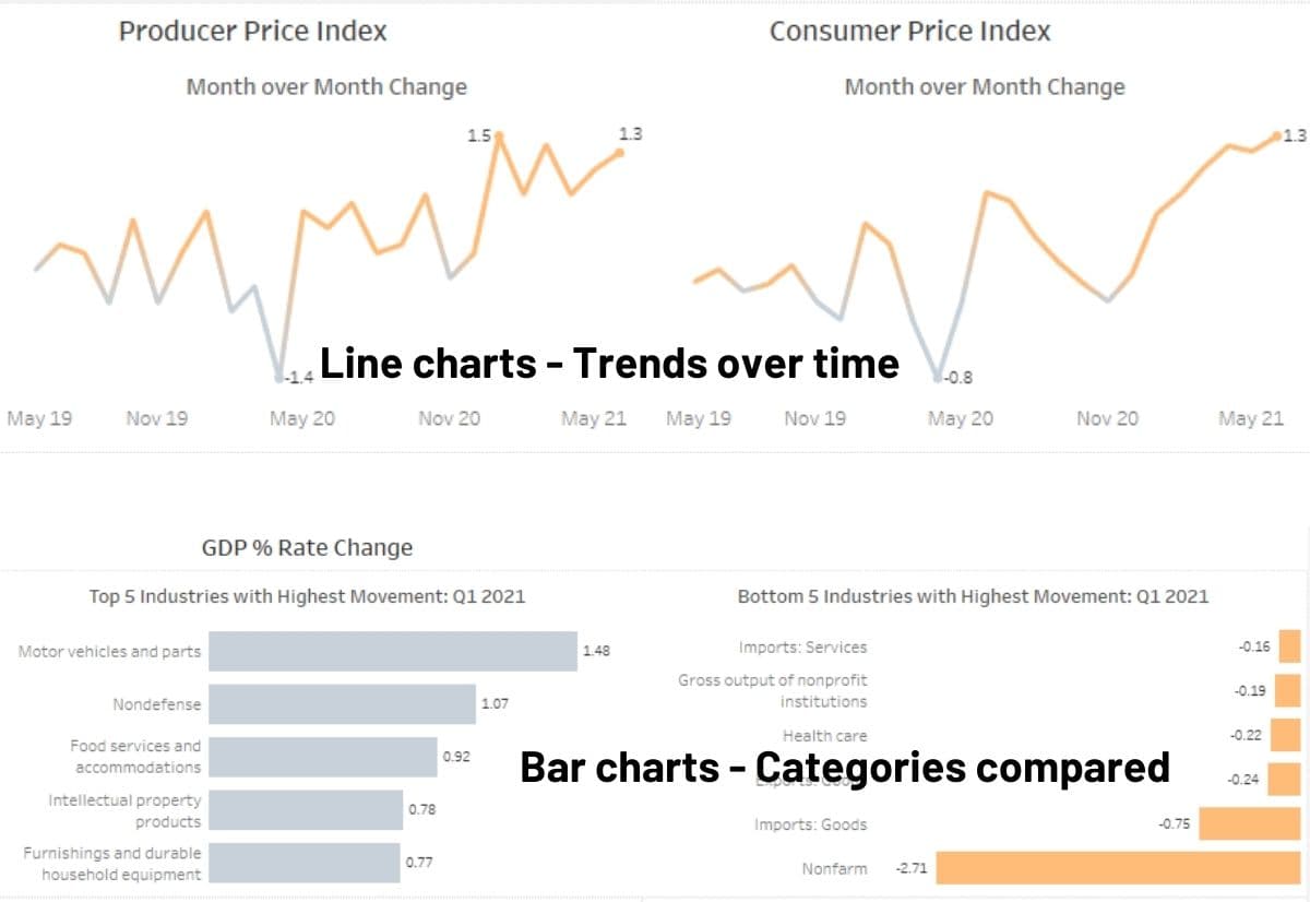
- Bar chart– uses horizontal and vertical x and y axis to compare discrete data according to their categories. It uses rectangular bars to divide the data points according to their values. Bar charts are useful for looking at different aspects of data, comparisons between variables and highlighting outliers.
- Line chart – lines that generally indicate a trend across time.
- Histogram – is similar to a bar chart in that is also plotted on a x and y axis and helps to identify outliers. But unlike bar chats, a histogram is used to represent continuous data, such as numerical values with decimals. In a histogram, the bars are not spaced out, like in bar charts, but clustered..
- Box plot– show the interquartile range of the median and distance to the minimum or maximum of the distribution of a variable in a data set.
- Scatter plots – also plotted on an x and y axis uses dots placed at the points of intersection between two variables to find a pattern or trend line in the data. The scatterplots can present hundreds of observations on a single chart.
There are a number of tools that are useful for EDA, but EDA is characterized more by the attitude taken than by particular techniques.
wikipedia
Dimensionality Reduction
Determining dimensions in a data set is needed for structuring the data. A high number of variables or even having more columns than rows, can cause ‘noise’ in the data. Talk about complexity!
But what is dimensionality reduction?
In general, dimensionality reduction is simply a method of decreasing the number of variables that will be used in further data analysis or machine learning.
Variables can also be called columns, features, inputs, or dimensions depending on how it’s being used, the experience of who is talking or even the software of choice!
So each horizontal descriptor or data point of a row (aka observation) is a dimension. If you have 30 columns, it’s 30 dimensions.
It is generally used as a component of exploring your data for more advanced analysis coming, but the relationship of your data is the key here.
Is there a relationship between the variables?
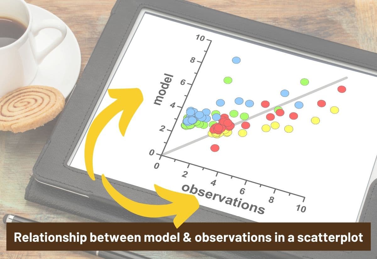
We talked about scatter plots above as it is a graphical way to look at your data, and it is a way to demonstrate relationships, as well.
In the image below, the scatterplot is hoping to identify a relationship between the observations (along the x axis) and model (along the y-axis) with the shading acting as a representation of a segment of the data.
Quantitative Analysis
Most of the time graphical methods are used in exploratory data analysis. However, the importance of quantitative method of exploratory data analysis is not by this diminished. It uses various statistical methods to find, measure and determine the spread of values and variables in a data set.
A few methods of Quantitative Exploratory data analysis include;
- Central Tendency- this involves finding the average or central location of a distribution of values in a data set. The measures of central tendency are, the mean, the mode and the median.
- Range- this is a simple measure of the values in an ordinal, interval or ratio scale by finding the difference between the highest and the lowest value.
- Quartiles- calculates values above and below the mean by dividing the data points into four to find the lower quartile and upper quartile in order to discover the interquartile range. The median is found in the interquartile range. A box plot is a good view for seeing how the data points fall within quartiles.
- Variance- describes the spread of the data and measures how far the values in a distribution differ from the mean
- Standard deviation- this is the square root of variance. It is used to determine the dispersion of a set of values relative to the mean.
Check out this YouTube tutorial on looking at these quantitative options using Python. Univariate just means you’re looking at the these metrics on a single variable at a time. No relationships are considered.

In a nutshell
Exploratory data analysis is a big preparatory exercise for further analysis of data. And talking about further; this is only a simple introduction and additional research would need to be done to gain an in-depth understanding of Exploratory data analysis.
Resources
It’s important to learn from your own experience, but it’s also smart to learn from others. These are the sources used in this article both online and from my personal library.
Tukey, J. W. (1977). Exploratory Data Analysis. Addison-Wesley.
Myatt, PhD, G. J., & Johnson, MSc, W. P. (2014). “Making sense of data i: A practical guide to exploratory data analysis and data mining, 2nd Edition”. Wiley.