SAS vs Tableau: A Quick Comparison
There are so many data tools that it is easy to get overwhelmed by the choices. While the number of tools is overwhelming, I have found that looking at how they compare to each other in smaller segments can be helpful to understand which tool is more appropriate for your situation. Let’s compare SAS Visual Analytics to Tableau data visualization tools here.
Tableau outperforms SAS Visual Analytics in its ease of use, data integrations, ability to share results, value, and support. SAS Visual Analytics has extensive data preparation and modeling capabilities along with the ability to handle larger data sources without add-ons required.
Overview of SAS Visual Analytics and Tableau
Let’s start with a quick overview of each system.
SAS Visual Analytics
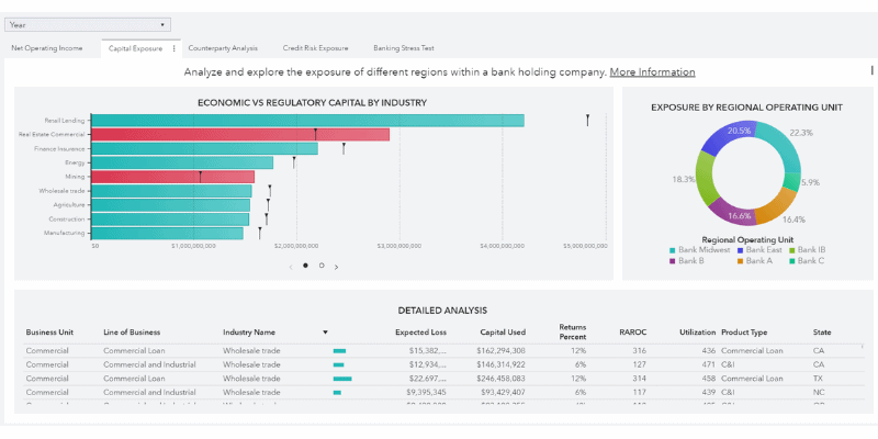
SAS literally stands for Statistical Analysis System and is the overarching company with a suite of analytics solutions. They are most widely known for their software also known as Base SAS that allows you to manipulate, access, and perform statistical functions on large datasets. Over the past 10 years, they have branched into more graphical product enhancements which are where SAS Visual Analytics (SAS VA) comes in as the Tableau competitor reviewed here.
Base SAS is primarily used for advanced analytics whereas SAS Visual Analytics is ideal for data visualization purposes. This is key as SAS VA is not as widely known and tends to be dismissed as part of a Base SAS bias with its heavy code needs.
While other SAS products allow for some visual tools such as graphing, SAS VA is the product that allows for more visually appealing data visualization and would be the product to compare with Tableau. Reports and dashboards are possible along with a point-and-click interface that is a hallmark of successful data visualization tools with an underlying ability to perform advanced statistics.
Tableau
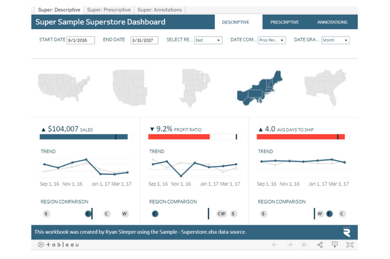
The list of products that Tableau is involved in is growing, but Tableau Desktop is their original software with a data visualization focus. The products that have cropped up in their line-up of options are add-ons to support Tableau Desktop. Tableau was revolutionary with its fully point-and-click functionality with very little coding needed when it exploded in the 2012-2014 time frame. Tableau has expanded the tools the software connects with and can now support advanced statistics through integration with data science tools such as Python, R, and even SAS specific datasets.
Overview Differences
Tableau focuses on providing data visualization tools that can integrate with other software to provide advanced analytics through Tableau Desktop. SAS focuses on providing advanced analytics tools and has created a product to support enhanced data visualization through SAS Visual Analytics. Each tool is coming from a different place of strength, and you’ll see how that plays out in the different categories.
Ranking System
For clarity, I am layering in a scoring system for each of the categories used to compare data visualization tools. While arbitrary, I mostly layered in the sentiment that each of the organizations I’ve worked with for tool selection used as a guide. The mostly is because they’d have a general idea of the cost before fully vetting a tool. Cost is a small piece of the ranking here as the focus is on the functions of the tool. In addition, there is not a way to generalize cost in an apples to apples way which we’ll review in the Value category.
The rating system is simply meant to act as a way to compare tools, so if a feature is a make-or-break for your specific situation, then use your situation to pick a different winner. This is just a guide! Let’s dive into the winners in categories important when choosing a data visualization tool.
Training & Ease of Use – 25%
Once installed and ready for use, it will take 3-4 months for someone to learn data visualization. This learning curve can be reduced through an easy-to-use interface for report builders and viewers, adequate training, and how hard implementing features is. This is weighted at 30% because of how important it is to get users producing with the tool and getting that return on your investment quickly.
Both organizations provide training to utilize their tool. Tableau provides excellent on-demand training for free. That’s right free, and it is excellent. SAS does not offer much in the way of a getting started style training for Virtual Analytics. Additionally, Tableau training is more readily found from third-party sources at more affordable price points whether you want an online or in-person training.
The interface of SAS VA is not quite as user friendly as Tableau’s. Both are point-and-click, but there is something less attractive and cumbersome about the SAS interface and finding what you need without a solid getting started guide is more difficult. I do believe part of this is because the tool offers so much more in the way of statistical functions. However, most users just tackling data visualization projects will find those functions super technical and need direction to use them.
Tableau requires very little ‘code’ type activity needed. You do build calculations for extra customization, but the code required for that is more similar to how you fumble through a Microsoft Excel formula versus full-on code needs.
Tableau has an advantage over SAS Visual Analytics in Ease of Use with an intuitive development and viewing experience, no coding needed, and more manageable training requirements.
Sharing Results – 25%
Sharing results is ultimately the most important activity you’ll be using with the visualization tools. Some prefer to take screenshots and load them into PowerPoint, but the magic happens with data visualization when you let your users interact with their data visually instead. As it is imperative that results are shared well in a way that works with your business, it is weighted equally with getting up and running at 30%.
Both SAS Visual Analytics and Tableau Desktop work well whether you are sharing with 1 or 1,000 colleagues or end-users, so there isn’t a clear advantage here.
Both have web-based options to share information, and both have security administration that protects information and allows for access at the individual row level within a data set. The options for tighter security are much more in-depth with SAS VA, but even the most sensitive of organizations have been pleased with Tableau’s security enhancements over the past few years.
When undergoing conversion efforts in particular or just diving into problem spots, being able to view the underlying data of a report is important. Tableau comes ahead as this is a built-in feature. SAS Visual Analytics requires you to have additional tools (Visual Data Builder or Report Designer) in order to display underlying data as part of reports.
In addition, Tableau allows for more interactivity with dashboards. You can create actions that will highlight and make changes to the reports that are not possible in SAS Visual Analytics.
So while both tools enable solid sharing opportunities, Tableau gives more transparency which is critical for end-users to operate with.


Integrations – 15%
Both tools integrate with a variety of data sources, and both continue to add new options in this space regularly. You would be hard-pressed to find any significant issues to connecting. The only exception to this would be SAS’s inability to connect to Google Analytics. The glaring Google Analytics connectivity gap used across many small to mid-size operations gives Tableau a lead here.
Value – 15%
Pricing is difficult for comparison because they do not price in similar ways. SAS is based on data size and processing needs. Tableau pricing is based on the number of creators and users. Essentially, you have to do an analysis of your analytics needs for a firm price.
SAS VA starts at about $8,000 annually as their minimum. Tableau starts at just under $1,000 for 1 report developer ($840 each) and 1 report viewer ($144).
I have worked with 5 organizations to bring-on a data visualization tool, and each instance has not led to using SAS Visual Analytics in part due to cost (even if they already had some SAS products in use within the organization). In general, SAS is known for being expensive across their product line-up.
Your specific analytics needs will need to be fully looked at for a good price comparison, but in my experience, Tableau has been the cheaper option. You will notice a trend here that Tableau tends to be a winner in other categories here and is generally cheaper, as well, so it is the leader in terms of value.
That said, if you have a large organization with significant data to analyze, the speed that SAS VA offers should be up for consideration. Big data in relation to how much you have on hand is relative, though. One of the organizations I worked with to choose a data visualization software went with Tableau despite having data warehouses that supported over 30 million customers.
Support – 10%
Working with data is another space that gets very complicated quickly. Whether you’re working on implementing the software or dealing with a complicated one-off issue, you’ll want to be able to connect with an expert to get your team rolling.
Both Tableau and SAS offer live support on a 24/7 basis and substantial help documentation for free. SAS Visual Analytics documentation is here. You’ll find Tableau’s documentation here. However, SAS VA is much more in-depth with all of the versions easily found for pretty much any function you can think of. Despite SAS VA having extremely technical documentation available, both feel like they are on level footings with company-provided support. That extensive documentation from SAS can be overwhelming, after all.
Tableau pulls ahead for support because its users have become a loyal fan-base of unpaid support. If you need help, the Tableau forum and social media help are on overdrive and readily available. You’ll get the help you need and fairly quick. Interestingly, Tableau users work magic in the tool during after hours, too. Each week, a public graphic is shared and the community is encouraged to recreate it based on data visualization best practices. Submissions are shared via Twitter, and the inspiration is shared. This is referred to as Makeover Monday, and it’s been going on for years. While it is not paid support, Tableau works to cultivate this community development through Tableau Zen Master appointments, competitions called IronViz (think Iron Chef) to show-off skills, and the best educational yet party-like conferences I’ve ever been to across industries. Fun and engaging is how I describe getting wrapped up in the Tableau community.
SAS users don’t seem to have this same love-affair with the tool. There are forums for help, but it’s not nearly as engaged.
Additional Features – 10%
Features are what truly set data tools apart, and this is no exception in the Tableau vs SAS Visual Analytics. The features the tools are capable of are weighted lightly, though, because I think we all expect software to do basic things first.
Both tools offer the ability for reports to be viewed through mobile apps for on-the-go report viewing, and both have email notification options for real-time alerts to problems.
SAS VA shines with its ability to process very large datasets on the visualizations you can create, and it offers the ability to have some data wrangling and some exploratory data analysis built-in to the functionality. Tableau does not have much available for basic data handling functionality and is better suited cleaned up before loading unless you add on Tableau Prep Builder. Additionally, Tableau is not suited for large datasets as users will suffer annoying performance issues when interacting with reports.
You can incorporate data modeling into the results of SAS Visual Analytics but not Tableau. Regression modeling, text sentiment analysis, decision trees, the options are incredible using SAS. There are a few features such as forecasting available in Tableau, but otherwise, statistical analysis is not built-in. You have to incorporate the results of any statistical by connecting to other tools such as R or Python.
SAS Visual Analytics has a clear advantage with the additional features that are part of their base product without incorporating other tools or add-ons.
The Results
| Category | SAS Visual Analytics | Tableau |
|---|---|---|
| Ease of Use (25%) | 3 | 5 |
| Sharing Results (25%) | 4 | 5 |
| Integration (15%) | 4 | 5 |
| Value (15%) | 4 | 5 |
| Support (10%) | 4 | 5 |
| Additional Features (10%) | 5 | 3 |
| Results | 3.85 | 4.80 |
Tableau is the clear winner as a pure visualization tool. Both tools are solid, but working with SAS is not as simple. If you’re willing to devote the time to learn the tool, you’ll have much more to work with (which is what adds to its complexity).


